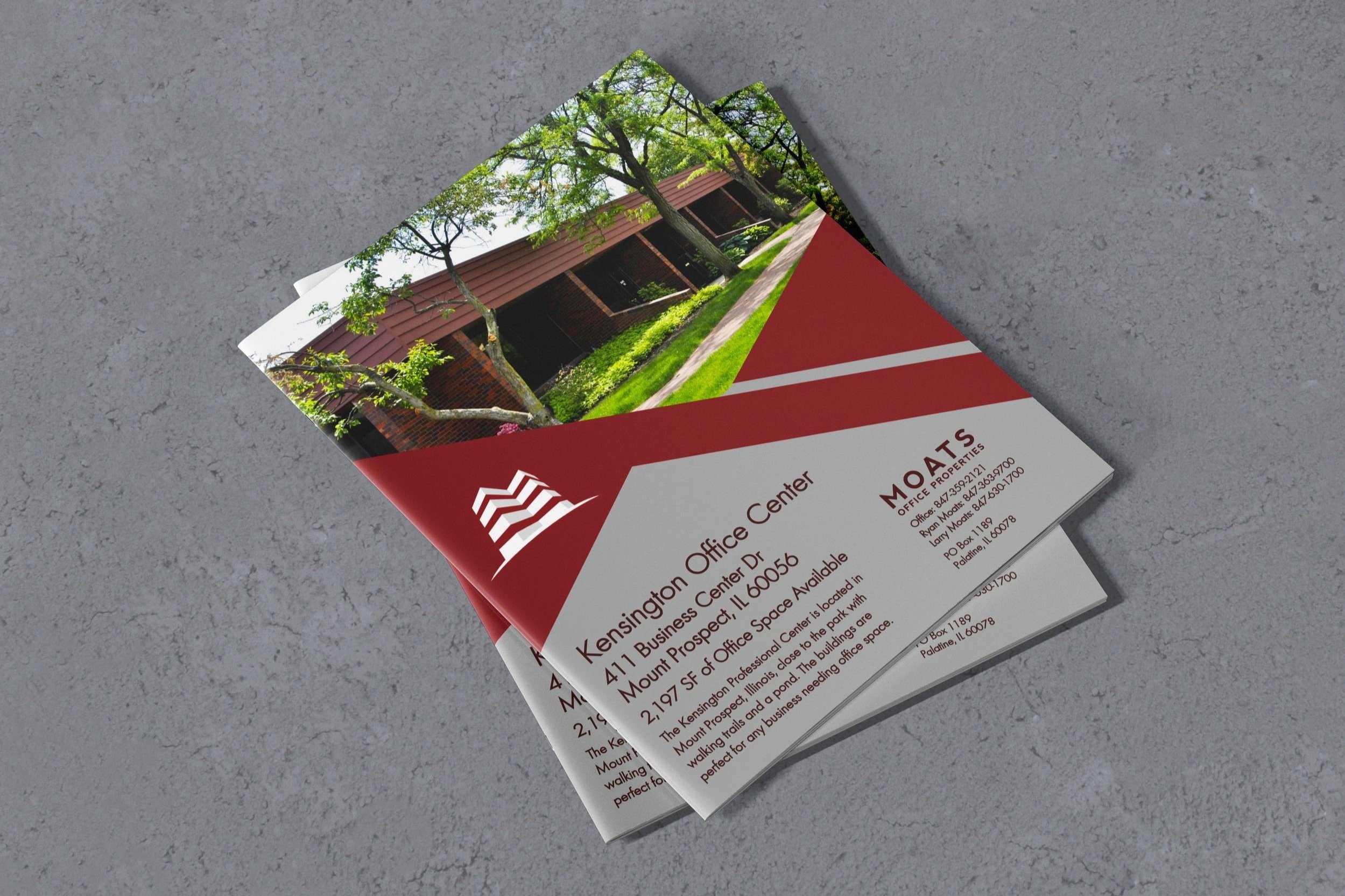
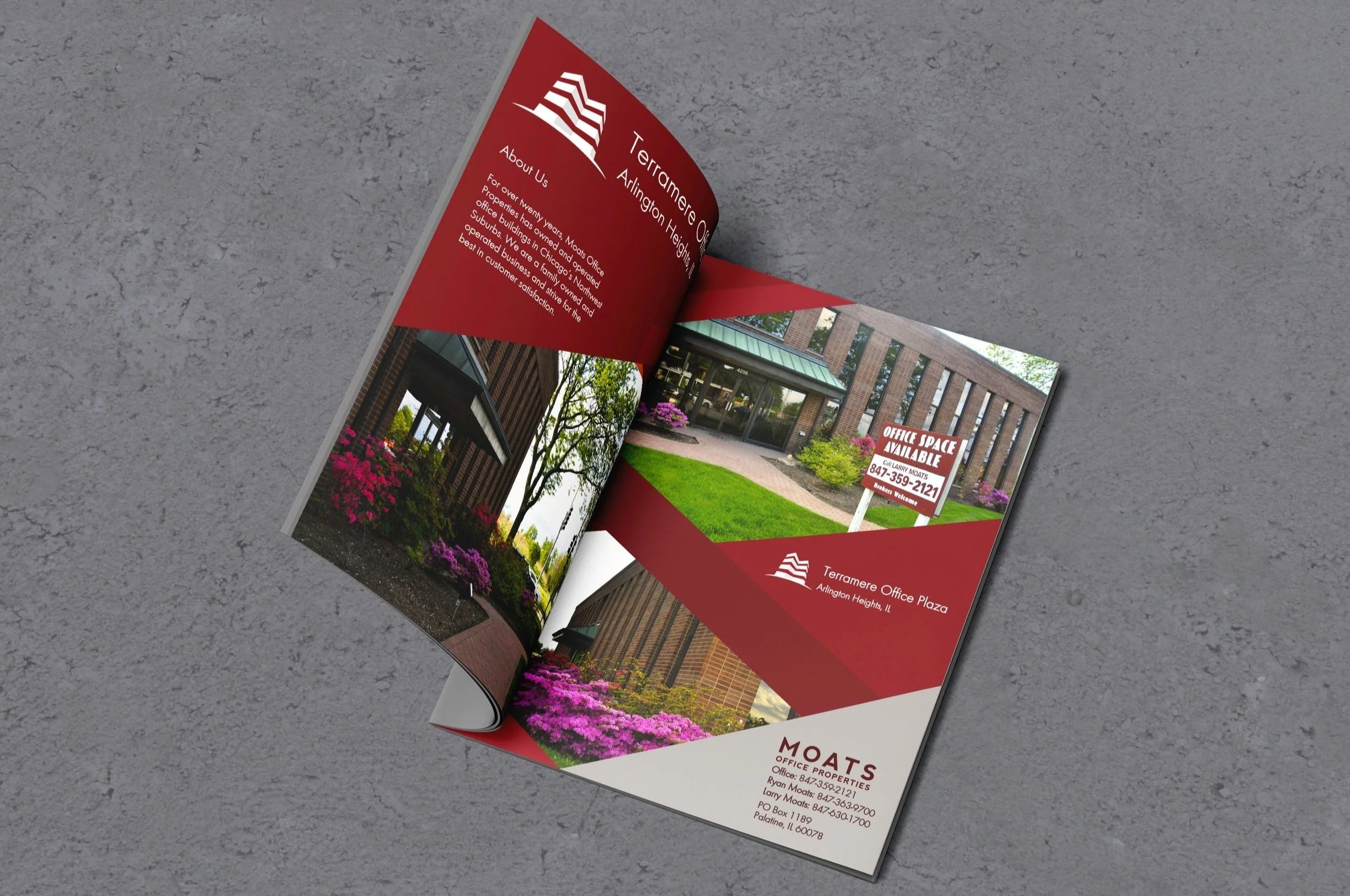
Branding design for the real estate company Moats Office Properties.
During my summer internship at MOP, Chicago IL, I had the opportunity to re-brand the company’s identity. I have worked on new business cards, letterhead, envelopes, notepads, package labels, and commercial brochures.
The company’s goal was to create a modern and fresh look to invite new consumers and communicate the company’s concept. Given the creative freedom to create visual effects, I focused on creating shapes and geometry that create a dynamic expression. The colors work perfectly together, and the sans-serif font gives a clean and transparent look.